Winter Apartment Marketing Outlook
5 Tips For Building a Better Mobile Site
- 2 August 2013
One of the most basic things you can do to grow your business is get a solid mobile plan. Thankfully, this doesn’t require any major investments like developing a mobile app – it can be as simple as getting a basic mobile website.
In one of Google’s studies, they found 57% of mobile users won’t recommend a business with a poorly-designed mobile site. Additionally, 40% of mobile users turn to a competitor’s site after a bad mobile experience.
So what should you do? It’s time to get a mobile site. A mobile site is the easiest way to bring more customers into your business. For example: 95% of smartphone users have searched for local info, 61% called a business after searching, 59% visited in person, and 90% of these users acted within 24 hours.
Here are our top five tips for you to get started with your mobile website:
1. Make it Fast
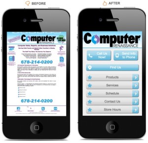
Mobile users are usually searching for your website while on the go, trying to get things done while they go about their day. In order to serve them, remove clutter and give them the basics they need to contact you such as your phone number, address and hours of operation.
2. Make Conversion Easy
Mobile users have higher purchase intent than desktop users, but they still need additional prodding to make a purchase. Focus on information that will help the mobile user convert: product details, photo galleries and simplified data entry.
3. Make it Touch-Friendly
Clear navigation is key with mobile users, as they don’t have as much screen real estate as their desktop counterparts. Minimize scrolling and make buttons large enough to press with a thumb. If a user “fat-fingers” a link one too many times, they might leave and never come back.
4. Make it Seamless
Users might check your website out at home, and then be reminded to check it while they are on the go. If they navigate to your mobile website and it is a vastly different experience from your desktop version, they might be unnerved. Keep logos and colors uniform across both sites, so it’s obvious that they are visiting your mobile site, not one of their competitors.
5. Make it Accessible
Your mobile site needs to work on more than one platform. Android and iOS make up the lion’s share of smartphone users, but you still need to cater to the millions of people that use other operating systems. Also, use HTML as flash doesn’t show up on mobile devices.
It’s time to get started with a mobile advertising campaign. Your business should be reaching as many people as possible, and mobile is the best course of action.
If you follow these tips in creating your mobile website then you should have no problem in converting and cashing in on the growing crop of mobile users.
Categories
- Auto
- Automotive Marketing
- Consumer Behavior
- Conversion Drivers
- Dealership Marketing
- Dummy
- Email Marketing
- Emailers
- Excellence
- Featured Posts
- General
- Google Adwords
- Internet Marketing
- Ipsum
- Live Chat
- Local Business
- Local Marketing
- Lorem
- Marketing News
- Marketing Research
- Marketing Strategies
- Marketing Tactics
- mobile marketing
- Multifamily Housing
- reputation management
- Retargeting
- Search Engine Marketing
- Search Marketing
- Senior Living
- SEO
- Service
- Social Media
- social media
- Student Housing
- video advertising
- Websites
The four ad mistakes that are Costing you leases
And How to Fix Them Fast!


